CARTO
DELIVERABLES
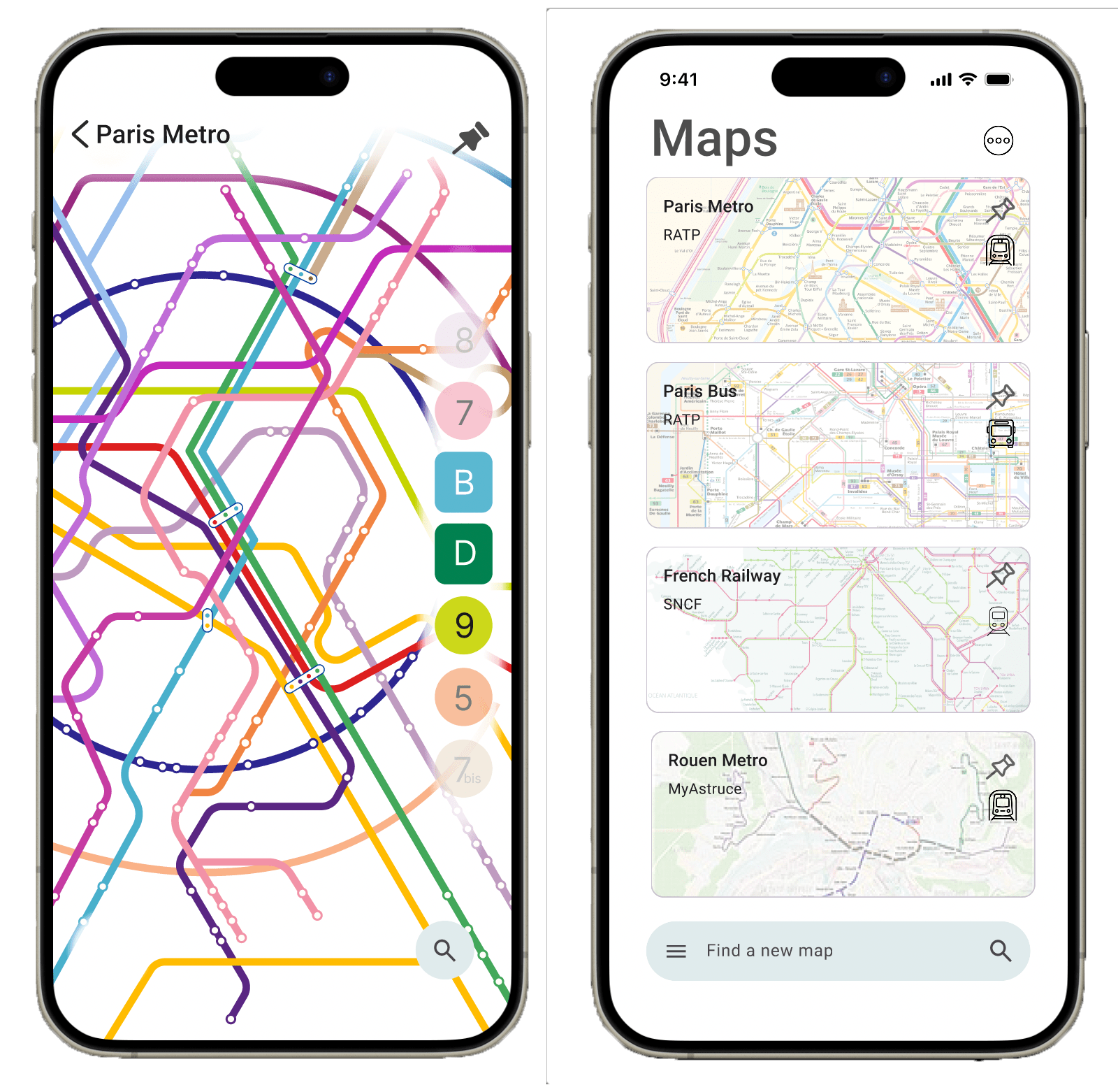
HIGH FIDELITY APP MOCKUP
VISUAL IDENTITY
MY ROLE
UI/UX DESIGN
UX RESEARCH
BRANDING
PROTOTYPE DEVELOPMENT
DATE
DEC 7, 2024
SCROLL
Goal
In this independent case study, I want to design something that simplifies navigation for people using public transit, both online and offline. Many users find metro and transit maps difficult to interpret and adapt to, especially when navigating complex routes or in areas with limited connectivity. I hope to connect different versions of a public transit map, providing a clear and intuitive way for users to understand their route and navigate obstacles.
Core features
1. Navigate seamlessly across the layers of any transit system.
2. Real-time updates about obstacles
3. Offline functionality – access that navigation anywhere
SCROLL
In the beginning
In Spring 2024, I attended the
Transit Mapping Symposium in Abu Dhabi,
which welcomed mapmakers, designers, commissioners, academics, and
fans from across the world to discuss mapmaking strategies and
ethics. Panelists and speakers inspired me to think about transit
systems and how they exist only in so far as they are represented by
maps.
There were some questions left unanswered by designers and scholars
at the conference:
1. How do we demonstrate complexity on dense networks?
2. How can we better address stations and hubs, where painpoints are
concentrated?
3. How do we create more coherent signage and iconography to
represent the continuity of lines and stations?
I also conducted a competitive analysis of existing transit
applications, and then I performed a heuristic evaluation on the most
direct competitor.
Process
people to thing
Concept Discovery Interviews
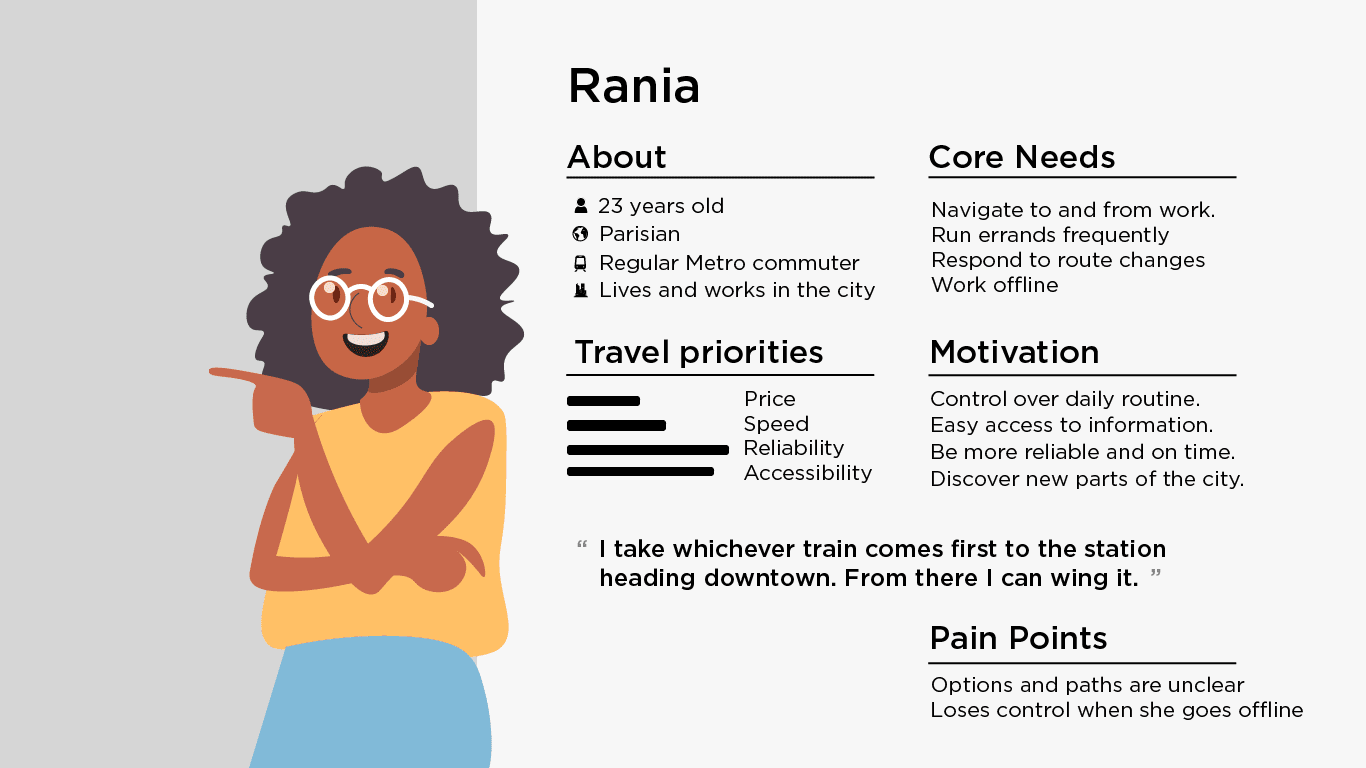
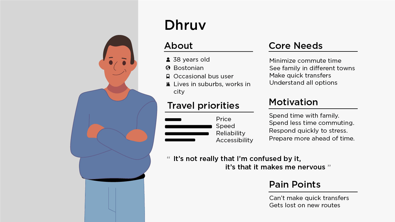
To kick it off, I formalized early conversations around public transit, hoping to find a place to intervene as a designer. I had 15 short interviews with people from medium cities, like Madison and Tampa, and big cities like New York, Mumbai, and Dubai. From these interviews, I extracted pain points and mapped their transit preference to different topics they cared about. The idea for a map integration app emerged from two themes. A common theme was complexity - several people described feeling stressed interpreting static maps. A friction point is navigating transfers and service disruptions. A similar theme was the frustration with offline navigation. People expressed a desire to feel in control during long transits between cities or underground.
Turning this research into two personas helped concentrate my efforts on who Carto can best serve.
“You can’t make things simple,
but you can help people manage
the complexity”
– Don Norman
Improvement Opportunities
These helped me understand existing tools and identify opportunities
for improvement: pain points: how to easily find their route,
interpret the map, and manage unexpected obstacles.
2. Connect multiple views (station-level, route-level, city-wide).
2. Focus on station navigation
3. Offline map functionality, where users could still access key
route information without needing an active internet connection.
With user flows, I outlined the steps people can go through to accomplish tasks in Carto, deciding what choices they could make and what features they would encounter.
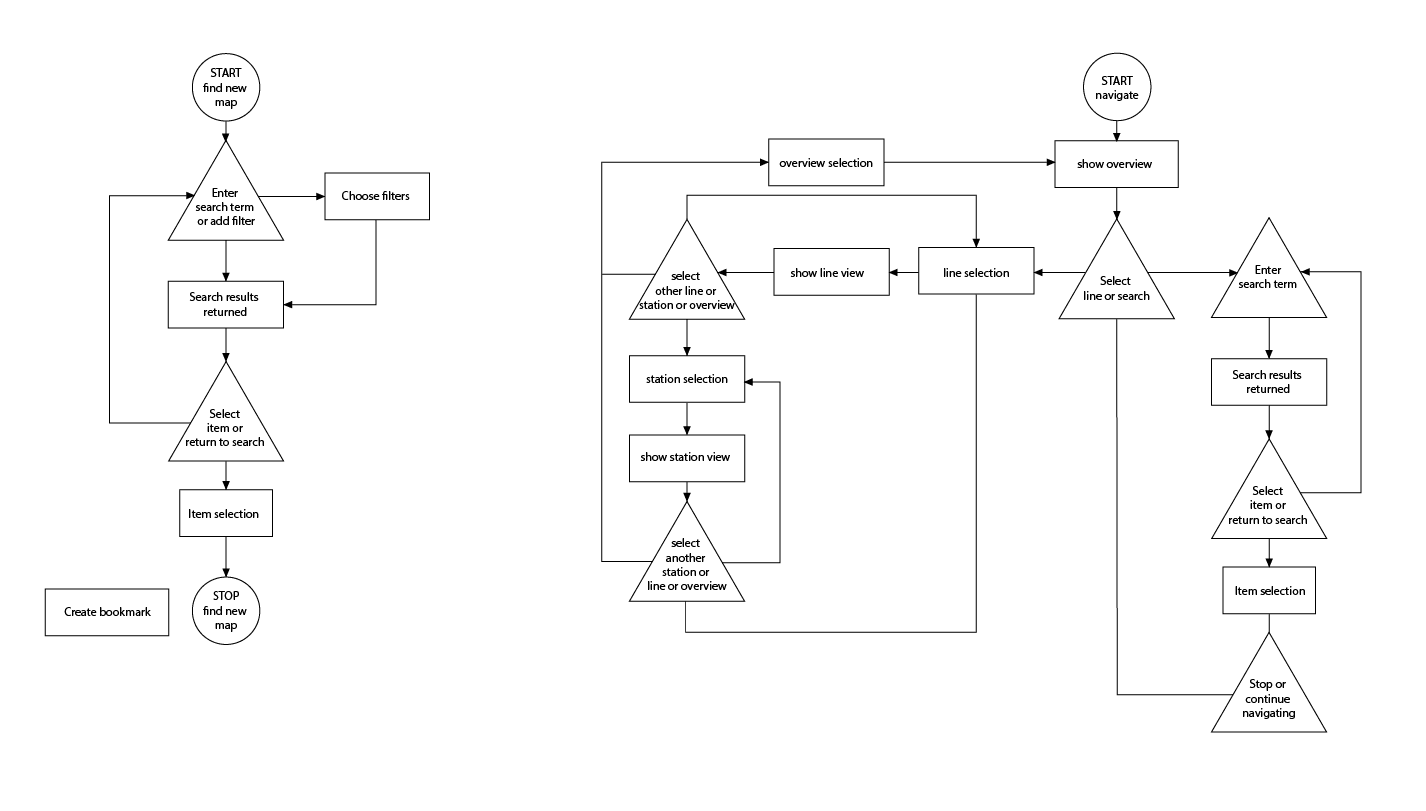
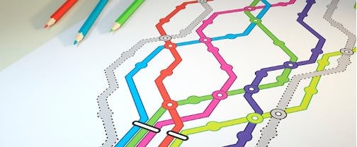
I then created low-fidelity mockups that would serve as early iterations of these task flows.
Usability Testing
Task-based studies:
Have people chart their own route using a starting point and destination I provide. The study consisted of 6 users tasked with finding a map of their transit map, finding a starting station, and navigating to the end using a demo of Carto. At the end, they were presented with a feedback form that included an industry standard System Usability Scale.
Major finding
Users know their starting point, but they need to be able to find it: Before running the test, I eliminated the search function - thinking that a live location update or search feature might ruin the experience by forcing the user to rely on GPS data. The first three test participants found the start of the workflow to be the greatest pain point, since they had to pinch and zoom to find their starting station. I added the search feature to see how it would change impressions. The start of the workflow dropped as a sticking point, and overall impressions of the workflow rose dramatically. Findings like this and how they informed my prototype can be found in my Results Analysis.
Takeaways
Divide up tasks:
I made so many mistakes at the beginning because I had my eye on the end goal. A common failure in usability studies is using research to validate hypotheses, rather than to hear open feedback. Learning to divide up steps and structure the process allowed me to listen and design better.
Accesssibility in UX:
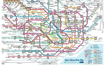
I chose the Paris metro map for my prototype because I'm a cheater. In designing the Paris metro map, Constantine Konovalov knew about the importance of accessibility - and around high contrast and legibility. Decisions he made in his sketch proposals didn't just improve the experience for users with different cognitive and visual needs - they made transit easier to navigate for all users, boosting confidence in wayfinding. By starting my design with lessons from his maps, I started with accessibility principles in the app's branding, color scheme, and text legibility. Hopefully, Carto is more intuitive, equitable, and effective because of it.
Documentation:
Effective documentation through wireframes, journey maps, personas, and design systems, is essential for aligning a project and communicating to stakeholders. As I embark to improve my UX design skills, documenting discrete steps also allows me to track my own progression and achievements. As I continue to iterate on this project, keeping structured documentation with data and prototypes will ensure a thoughtful and joyful user experience.